
Elev8
Restaurant management dashboard to help grow businesses
Elev8 is a business dashboard designed to help businesses grow by providing a streamlined management software. It can be used to manage locations, menus, orders, drivers, and more on both web and mobile. This case study includes an example dashboard for an established business as well as a landing page designed to promote the product.
What/
Web App, Landing Page
Role /
Designer, Researcher
Category/
Business, E-Commerce
Year /
2025

Market Research

Running a small business is extremely hard. According to 2024 data from the U.S. Bureau of Labor Statistics, 20.4% of businesses fail within the first year. At 5 years that increases to 49.4%, and at 10 years it increases even further to 65.3%. Businesses need the right tools to ensure their success year after year.
The claim
The failure rate of small businesses is very high because of all the intricacies that are required to be successful.
The problem

Initial research
Business owners need tools designed to help them grow and expand into new areas without adding more stress. A dashboard where owners can track sales, deliveries, products, and more is needed and will benefit these businesses.
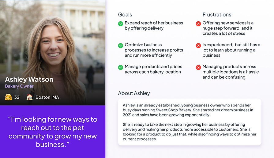
Personas
I created a persona based on a primary of user of the app. A business owner looking to utilize new tools to expand their business reach.
Starting the design
After completing the research, I began to sketch out flows and the beginning of my low-fidelity wireframes.

Flow diagram
To determine the necessary features of the app, I created this flow diagram based on the most important features of the app. This includes primary and secondary actions between pages.

Low-fidelity wireframes
After determining the flow diagram, I started to create low-fidelity wireframes of the main screens.


High-fidelity UI Design
After designing the wireframes, I researched a color scheme that fit both the product and the business dashboard.


Friendly look and feel
The idea behind the palette was to capture a ‘sweet’ and ‘light’ feel, similar to what you would find in a bakery. Also created was a fake business that fit this theme.


30+ high-fidelity screens created
These include 12 web screens, 20+ variations of mobile screens (focusing on page navigation), and many other varying designs of screens which have the potential to be used in A/B testing to further the design.
Testing also included ways to simplify complicated, information heavy screens such as the orders screen to be usable on mobile.
Conversion to mobile design
After completing the web design, I converted each page into a mobile friendly alternative. To do this, there was a slight redesign of the navigation system to ensure ease of use.


The largest change was the layout of the order navigation to avoid overloading the user with information. It was broken down into tabs to sort the data clearly and efficiently.
Landing page design
After designing, I created a landing page to showcase what this app would look like as its own product. I came up with the name Elev8, then typeframed and designed a few pages for different breakpoints.

Click here to view the web landing page
or here to see the mobile version instead

Responsive breakpoints
Three breakpoints were selected at 1400px, 744px, and 390px. All of the decorative elements were made with the idea that they would fit effortlessly on each breakpoint. So all that was needed was a slight reorganization of elements.
The main goal for the smaller screens was to simplify the design to make mobile use more efficient for quick access with simple actions

Project summary
During this project, I wanted to emphasize the different breakpoints to create a product that was designed for web, but would also be usable on the go. A lot or preplanning went into the initial stages by creating required imagery that would easily scale, and site structure, which made each subsequent stage easier. For the landing page, type framing ensured the copy would be able to stand on its own, even without all the added imagery to create a final page that showcased the entire project.
