
Wag Along
A social app for your furry friend
Wag Along is an app prototype that allows you to search for pet friendly locations near you. You can find parks, restaurants, lodging, and more in your area. The theme behind the app is "seeing the world through the eyes of a dog". Which is why I used a blue, yellow, and gray theme.
What/
Native Mobile App (iOS)
Role /
Designer, Researcher
Category/
Social, Entertainment
Year /
2024

Market Research

The demand for pet friendly locations is growing rapidly. In 2024, Americans spent $151.9 billion on their pets. While the global pet travel market has seen significant growth with expectations to reach $3.73 billion by 2030.
The claim
Pet owners are looking for new inclusive social spaces that mix pet friendly with social entertainment, but most already existing apps don’t fulfill all of the needs of its users.
The problem
Competitive analysis
I analyzed a few popular apps in the category. Looking at both the searchability and social aspect of each, while also looking at some critical reviews to see the general consensus of what could be improved.
BringFido

Sniffspot

DogPack
The good
All apps allow you to search for/ find dog friendly locations near the user
The bad
All are lacking a strong social aspect, while also lacking an intuitive interface, require a subscription (Sniffspot), and are missing many locations making it harder to find new places (DogPack)
Problems from the reviews
BringFido
“I was really excited to use this. Unfortunately, the UX and ergonomics of the app are god awful”
Sniffspot
“Sniffspot used to be a great app, but they are now requiring a subscription to use.”
DogPack
“I have 3 dog parks within 2 miles of my house and it does not show any of them. It just isn’t helpful”

Initial research
As the pet industry continues to see increased growth, owners are looking for more things to do with their pets. An app for finding new pet friendly locations, with the ability to connect with others, and that is easy to use is in demand.
Personas
I created two personas based on different types of users of the app. A business owner and a traveler in a new area.


Starting the design
After completing the research, I began to sketch out flows and the beginning of my low-fidelity wireframes.

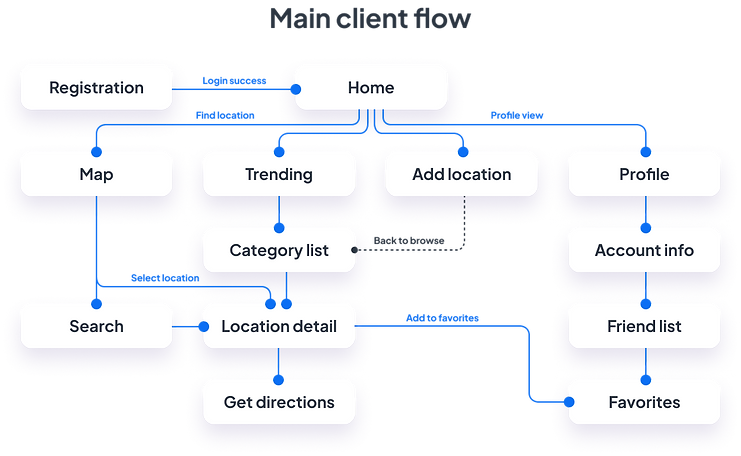
Flow diagram
To determine the necessary features of the app, I created a flow diagram based on the main tasks a user can do. Check out one of those flows below.
Low-fidelity wireframes
After determining the flow diagram, I started to create low-fidelity wireframes of the main screens.

High-fidelity UI Design
After completing the flow and wireframes. I began to look at colors and fonts, and created a few screens in the app.


Friendly look and feel

The idea behind the palette was ‘seeing through the eyes of a dog.’ Who primary see shades of blue and yellow, while using bright colors to give a playful friendly feel.

40+ high-fidelity screens created
These include variations of navigation (such as tab bar and hamburger menu) and many varying designs of screens which could be used for A/B testing as the design progresses.
Testing also included many button designs and graphic designs to give the product the friendly, welcoming feel I was looking for.

Alignment and grid
For the design I used an 8-point grid and set the margins within groups to 8 and 16, with the margins outside groups at 24, 32, and 40.

High-fidelity prototype
Using my high-fidelity screens, I created a clickable prototype with the goal of testing the app on potential users.

Prototype testing
I completed a short usability study to test some key components of the app. Onboarding and finding locations. It was important for users to know that each category had a different subset of locations, and how to find the one they are looking for.
After the test, the users answered a few follow up questions that were used to improve the flow of the app and ensuring navigation was smooth.

Study results
One of the main issues brought up was getting directions. In the original design, location pages had an add to favorites button which was also already located at the top. To reduce redundancy and make the app easier to use, the button was replaced with a get directions button.
Prototype update concept
Due to limited time, a second usability test was not able to be completed. However, key feedback from the first session was applied to the app (ex. explain what changes were made)
Accessibility evaluation
Upon completion of the final screens, I evaluated elements such as contrast and proper touch targets to meet the WCAG AA standards.

One specific issue I noticed was with the body text color. Initially, I wanted to emphasize the key attributes like amenities and hours over the longer text. But the contrast was poor, especially with the subtle background color.
Project summary
During this project, I started by evaluating the market and similar apps, while working through the whole design process to iterate and grow the app each step of the way. By creating personas, conducting user surveys, and usability tests, I ensured that this app will fulfill the needs of its users. To top it off, creating low and high fidelity screens and prototypes, and an accessibility review to make sure the app wasn’t only appealing, but also usable for the largest audience.
